Guiding first-time users to launch successful jobs
ROLE
Product Design Lead
DURATION
6 months
GOALS
• 25% increase in jobs created
• 50% increase in successful job launched (>90% quality output data)
Overview
For teams looking to label unstructured data for their machine learning algorithms, CrowdFlower offers a platform with tools to achieve structured data quickly and accurately. This involves a combination of human annotation via contributors around the world and machine learning predictions at scale.
Problem Statement
During its transition from a managed service provider to a self-serve platform, CrowdFlower overlooked the first-time user experience, leading to early funnel drop-off and poorly designed jobs, which resulted in unusable output data for many users.
Research
In-person observations
To gather insight into the existing product, I set up usability sessions to observe the first-time user experience of new users who had not yet created or launched a job.
Welcome page (after sign up)
Some users played the ‘How it Works’ video — mentioned it was too long and focused on a use case that didn’t match their needs.
Users were not quite sure what to do next, but mostly clicked the ‘Get Started Now’ button .
Some users were surprised the ‘Get Started Now’ button took them to the templates page.
On the templates page, users struggled to find relevant options for their specific use case.
Some users showed frustration with the long grid of “tiles” and no discoverability options.
The video isn’t useful for the type of data I need structured
Job creation flow (after template selection)
Some users began by clicking through sections in the primary navigation, unsure of where to start.
Users understood the ‘Title’ and ‘Instructions’ inputs however were confused on how to add questions and “display their data”.
Users had a difficult time interacting with the controls to add questions to their job, and found the options limited, which led to users switching to the code editor.
Users mentioned the placement of the instructions section under the title didn’t make sense to them, as they preferred to write instructions after questions were added.
Additional feedback
The mental model for a majority of users was to upload their data first, then build their job.
Users were confused by the placement of the 'Job Settings' link under the 'Quality' section, as it encompasses all aspects of the job.
The product broke when users attempted to create test questions with a poorly designed job
Ok, I’ve clicked around a bit, but were should I start
Design
Ideation
To gather insight into the existing product, I set up usability sessions to observe the first-time user experience of new users who had not yet created or launched a job.
Solutions
Welcome page (after sign up)
To improve discoverability and reduce cognitive load, I organized templates into the top eight use cases on the page. The idea was that users could find relevant templates more quickly by starting with the question, 'What would you like to do?'
Additionally, I removed the welcome video due to its low completion rate and replaced it with a feedback option for users who couldn’t find a suitable use case to get started.
Job creation flow (after template selection)
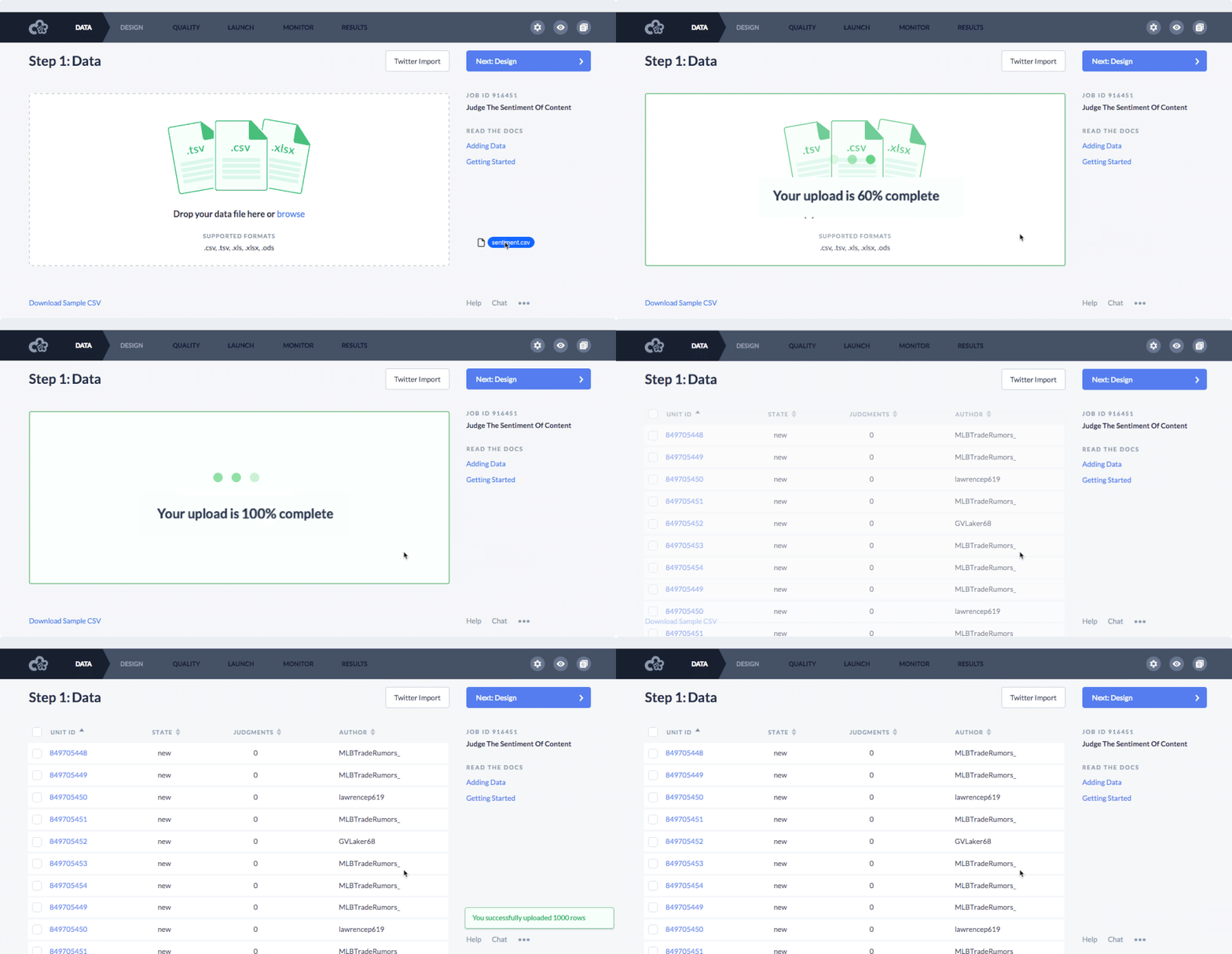
To help users better understand the job creation flow and identify their next steps, I designed a linear navigation system that provides access only to the relevant steps, enabling users to focus on the task at hand. Additionally, I added clear messaging and a primary action button at the top right of all sections to make the next step self-explanatory, visually conveying progress to the next screen.
Graphical editor
Based on observations from the existing graphical editor, I designed a more intuitive UI that gave users better control over their content.
In addition, I reordered the hierarchy on the page to match users expectations: 1. Title, 2. Content (questions and data), and 3. Instructions.
Additional changes
Designed a feature so users could map their data columns with templates so it showed up instantly in their job design
Created a better ‘Add question’ UI so users could see changes in real-time
Moved the ‘Job settings’ out of the primary navigation and provided smart defaults for users
Results
Before making the redesign generally available, we rolled out to a subset of users to collect results. Based on pre-post data of first-time users, we observed the changes to be rather impactful.
25% increase in jobs created
SUCCESS METRIC
ACHIEVED METRIC
44% increase in jobs created
25% increase in successful job launched (>90% quality output data)
SUCCESS METRIC
189% increase in successful jobs launched (>90% quality output data)
ACHIEVED METRIC


