


Streamlining workflows for faster, easier hiring
ROLE
Researcher & Lead Designer
DURATION
2 months
GOALS
Phase 1
• Design and deliver component migration with 100% coverage
• Incorporate 5 usability improvements
Phase 2
• Conduct 5 user interviews
• Complete 2 redesigned solutions
Overview
Cornerstone ATS (Applicant Tracking System) is a software solution within the broader ecosystem of Cornerstone products, designed specifically to help recruiters manage candidates as they progress through various stages of the hiring process.
Problem Statement
Primary
Cornerstone's ATS was outdated and unintuitive, featuring UI components that were inconsistent with advancements in other areas of the platform.
Secondary
Recruiters using Cornerstone’s ATS spend excessive time manually reviewing and managing candidates throughout the hiring process.
PHASE 1
Component migration
Audit
Component mapping
To begin, I did a comprehensive audit of the existing components and interaction patterns across 14 responsive pages, mapping them to the newer components in our updated design system. Of the 24 components identified, 23 aligned with our new design system.

Heuristic evaluation
After completing the audit, I conducted a heuristic evaluation to identify usability issues that could be addressed during the migration.
The disabled state of the bulk action buttons could be mistaken for clickable options. Additionally, the spacing in this area was not properly adjusted for smaller, adaptive layouts.
The feature to hide and reorder columns was accessible by clicking the gear icon at the far right of the table, which typically denotes 'Settings.'
The interaction element to 'Save' the sidebar selections was a checkbox, making it unclear whether it saved upon toggle or required a double click.
The sidebar scrolled relative to the content area, creating a large empty space and requiring users to scroll back to the top to access it.
Key findings: Base page
The filter bar at the top of the content area pushed candidate information below the fold and was redundant with the filters in the sidebar, increasing cognitive load for users. Moreover, the filters at the top did not appear to be clickable elements.
The candidate table content scrolled horizontally, hiding important information and actionable items.
When scrolling down the page, the table actions moved relative to the table content, forcing users to scroll back to the top of the page to perform actions.
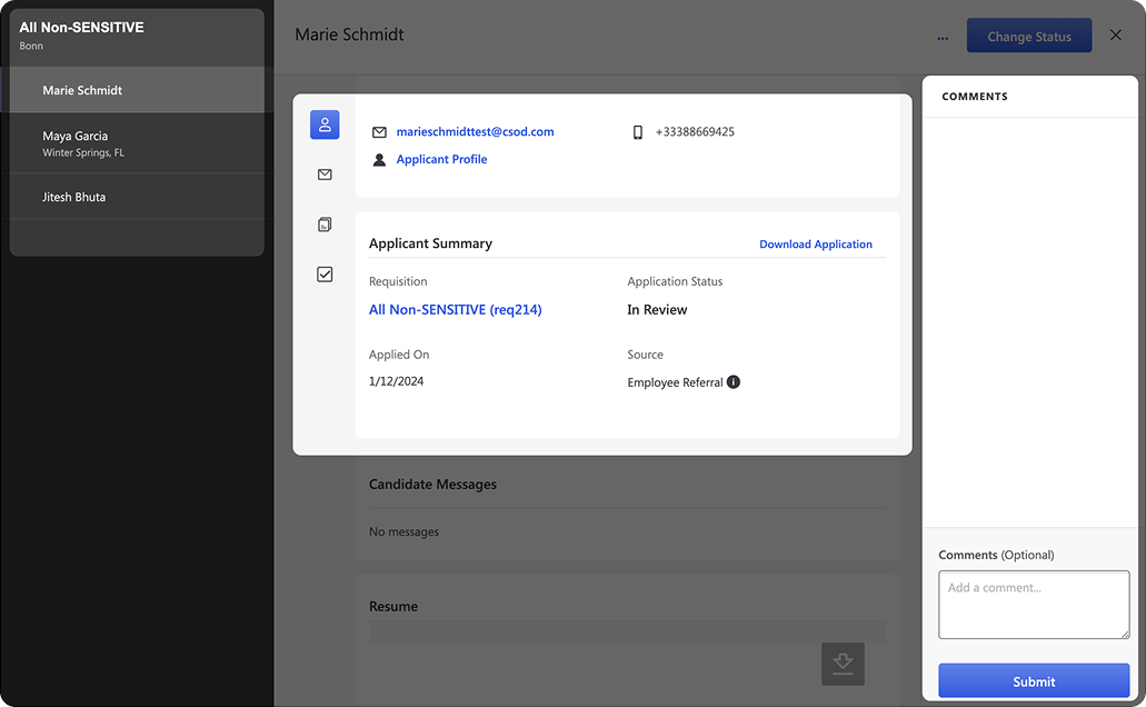
Key findings: View profile (full screen modal)
The fullscreen modal lacked clear section identification and proper navigation back to the base page.
The left sidebar used a dark mode palette, but no other components in the app adopted this style, resulting in inconsistency.
The main content area was missing headers and a clear hierarchical structure.
The right sidebar 'Comments' section did not include an empty state message or a call to action.
Design
Responsive pages and layouts
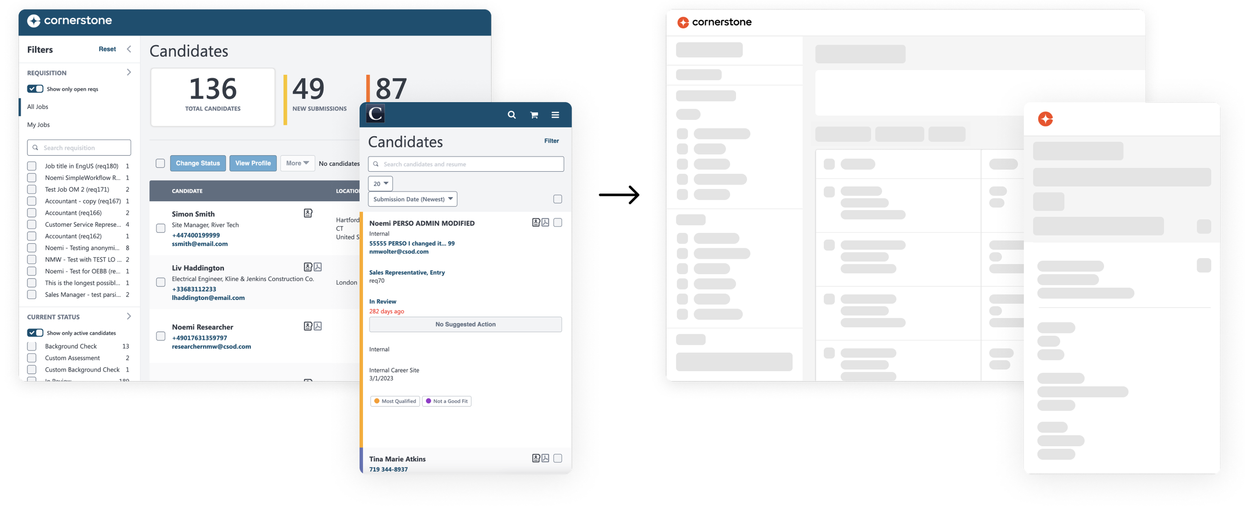
After the heuristic evaluation, I designed 14 pages incorporating the new components: the base page, view profile, and 13 fly-outs.

BASE PAGE

VIEW PROFILE

FLY-OUT (1 of 13)
UI improvements
Base page
Removed the redundant filter header to move the table up, allowing more candidates to be displayed on the screen.
Designed a sticky header for the table actions, so users don't have to scroll back to the top to access them.
Replaced the 'Gear' icon with a 'Column' icon for column reordering/ hiding.
Designed inline table interactions for column reordering and sorting.
Added a subtle divider to indicate that the 'Candidate' column is fixed, while the other columns scroll horizontally.
Replaced the sidebar 'Save as default' checkbox with a link to improve interaction design.
Replaced the sidebar single caret collapse icon with a double caret icon for better recognition.
View Profile
Updated the dark sidebar to a light one for a more cohesive experience across layouts.
Improved the hierarchy in the content area to enhance section scanning and readability.
Added a 'Profile' header to provide better page context.
Incorporated a CTA and quick feedback options into the comments area.
Fly-outs
Specified requirements for handling different width sizes based on content.
Overall, improved interaction design and usability across components in 13 layouts.
Engineering hand-off
Once all the layouts were designed, I created a hand-off document that included state behavior, spacing, loading transitions, breakpoints, etc. — and reviewed it with the engineering team.
Additionally, I built several prototypes to better convey how interactions work.
Sticky header →
Sorting →
Pinned column →

PHASE 2
Redesign
Research
User interviews
Collaborating closely with the internal team, I scheduled and conducted five interviews with recruiters to better understand their use cases, needs, and motivations on the platform. Additionally, I observed recruiters performing tasks with the existing design, allowing me to identify specific pain points and areas for improvement.
Key takeaways
Recruiters typically access the Manage Candidates page through the Manage Requisitions page, where they click on a specific requisition.
Recruiters complete most tasks on the ‘View Profile’ page after bulk selecting candidates in the table.
Filters on the left sidebar are preferred over those at the top, as the top placement consumes valuable space on the page. Additionally, the top filters were “buggy”.
Users can’t view the entire table at once due to horizontal scrolling, and are unaware of features that allow them to hide and reorder columns.
Job titles occupy excessive space, which is unnecessary when recruiters are focused on a single requisition.
The comments section on the ‘View Profile’ page is poorly organized. One user described it as “like a notepad,” making it difficult to read and absorb information.
The ‘Hiring Manager’ workflow is vastly different than ‘Recruiters’.

I usually bulk select and review candidates on the view profile page

Design
Ideation
After a deeper analysis of interview data, I found that improving efficiency was the top need from recruiters, which guided my design solutions.
Solutions
HYBRID DESIGN
STREAMLINED TABLE
HIRING MANAGER FEEDBACK
Notable changes
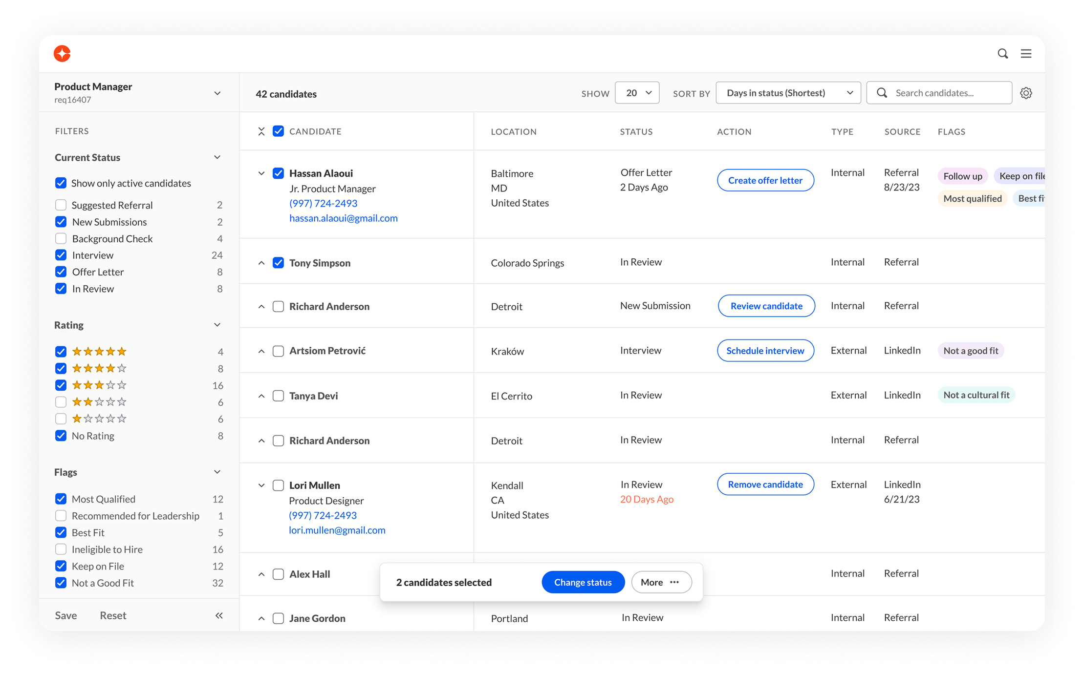
Hybrid design
The requisitions filter has been removed from the sidebar. Users now view one requisition at a time and can quickly access relevant candidates.
The base page and 'View Profile' have been integrated into a single layout, featuring a modern design that replaces the traditional data grid.
Candidate feedback has been moved to a separate tab, with notifications appearing when new feedback is received.
Streamlined table
The interface is designed to maximize space for viewing candidates in the table.
The table features a collapsed row streamlined view and an expanded row detailed view. Bulk actions are accessible via a floating element.
Hiring manager feedback
Unnecessary UI elements have been removed to emphasize the feedback area.

Results
Migration with 100% coverage
SUCCESS METRIC
Migration with 100% coverage
14 responsive pages, 23 components
ACHIEVED METRIC
5 usability improvements
SUCCESS METRIC
ACHIEVED METRIC
12 usability improvements
SUCCESS METRIC
5 user interviews
ACHIEVED METRIC
5 user interviews
SUCCESS METRIC
2 redesigns
ACHIEVED METRIC
3 redesigns