Redesigning the music playing experience on Android
ROLE
Sr. Director, Product Design
TEAM
1 Product Designer
1 Sr. User Researcher
DURATION
2 months
GOALS
• 5% increase in total songs played
• 2X reduction in support tickets
Overview
The BitTorrent Android app is a torrent downloader that enables file sharing across a vast network, serving millions of daily active users. It also features an integrated music player, allowing users to listen to downloaded audio files directly within the app.
Problem Statement
The music player faced significant usability challenges that impacted user satisfaction and engagement.
Research
User interviews
We conducted interviews and identified several key areas for improvement with the music player.
Users reported difficulties due to navigation, confusing section labels and small tap zones. In general, the feedback revolved around usability issues and poor interaction design.
Furthermore, users sought the flexibility to interact with the music player while exploring their music collection — a capability limited by the player’s fixed placement on the ‘Queue’ tab.
When I’m listening to music, I want to change songs quickly and have easy access to controls. It’s frustrating because I have to add songs to a queue every time.
Benchmarking
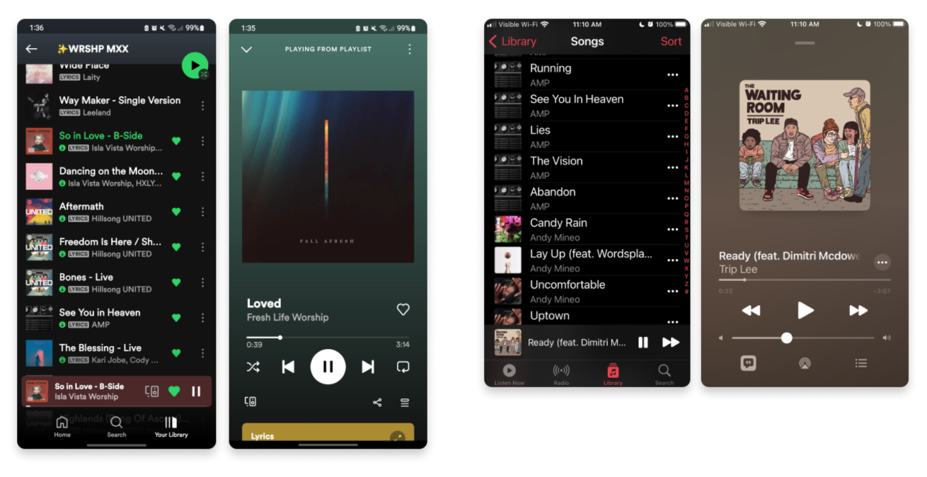
We looked at several music apps to better understand existing patterns and interactions users are familiar with. Since music apps are common, we wanted to create an experience that reflected learned behaviors.
Design
Solutions
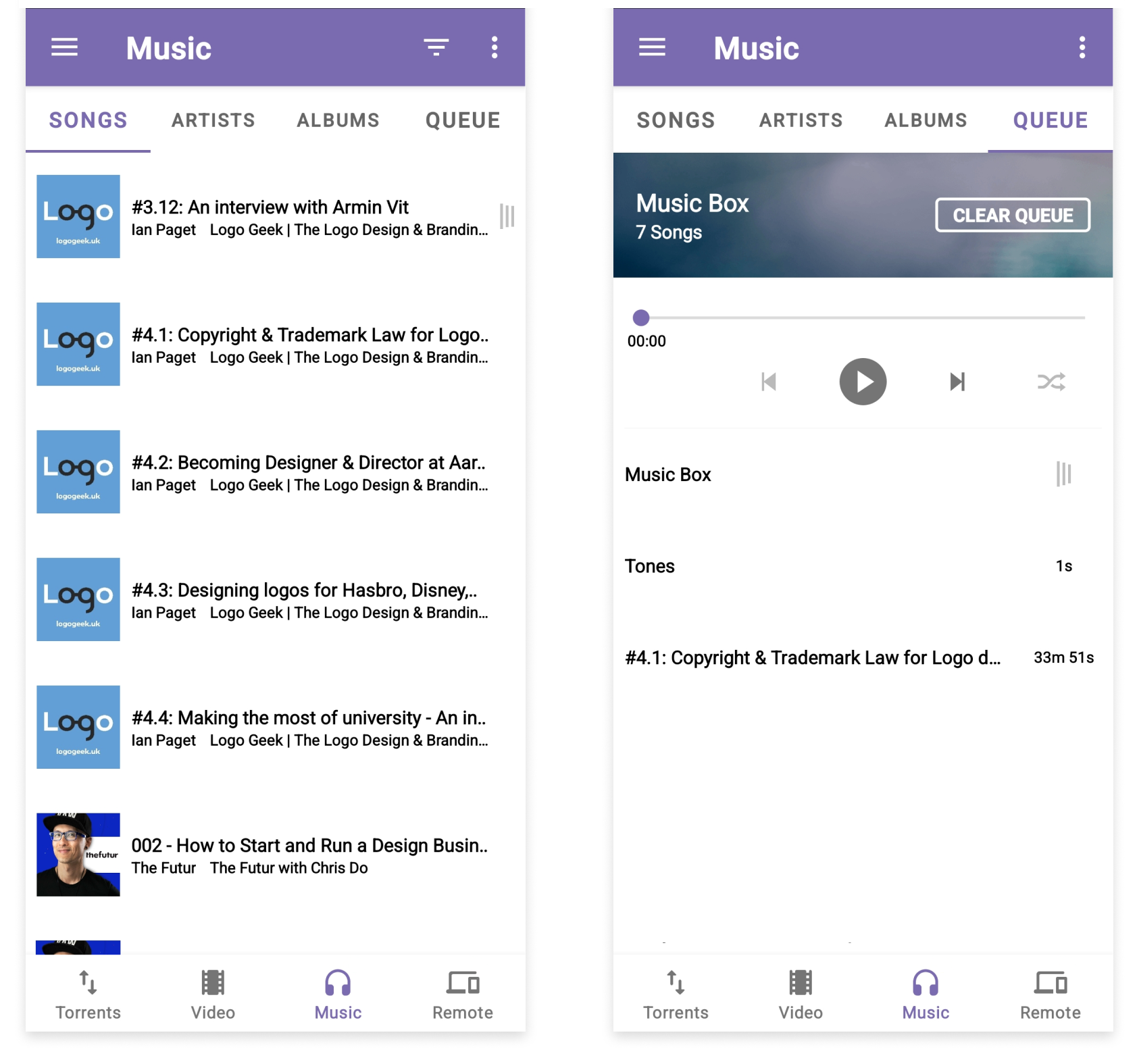
EXISTING DESIGN
Usability and interaction issues with the existing music section:
Unexpected navigation
When users tap a song in the ‘Music’ section, they expect it to start playing immediately. Instead, the current interaction directs them to the ‘Queue’ tab and adds the song to the end of the queue.
Limited visual cues
There is inadequate visual indication of which song is currently playing within the list, making it difficult for users to follow their listening experience.
Small tap areas
The music player controls feature small tap zones, leading to unintentional taps and a frustrating user experience.
Confusing shuffle button
The shuffle button appears to be in a disabled state when turned off, causing confusion about its functionality. Notice the disabled previous button is using the same color.
Missing album art
The absence of album art in the player view detracts from the overall experience, as album art serves as a strong visual cue for identifying the current song or album.
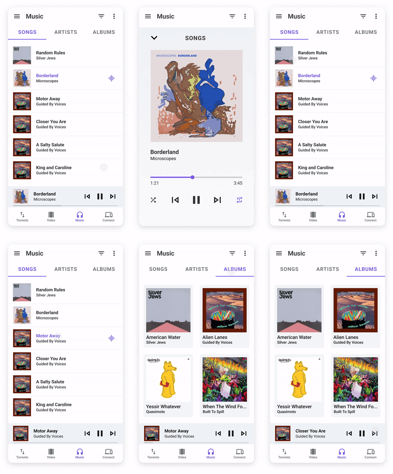
PROPOSED DESIGN
Based on user feedback and music app benchmarks, we made several changes to the music section.
Playing a song
We removed the "Queue" tab, which acted more as a "recently tapped" list than a traditional queue. Now, when users tap a song, it starts playing immediately as expected.
Music player controls
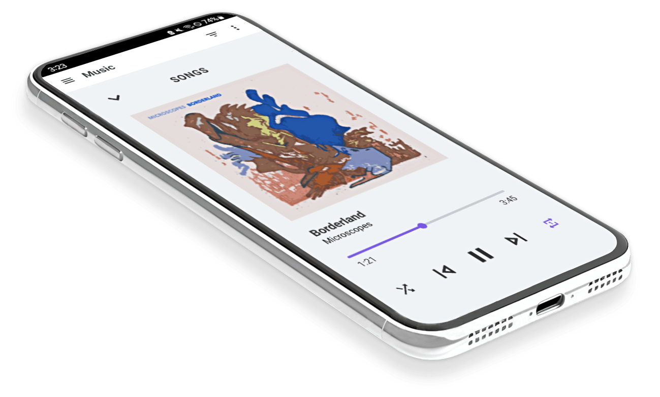
We introduced a music player bar, allowing users to access controls without needing to navigate to the "Queue" tab each time. Additionally, users can tap into a full screen experience for expanded controls and functionality, aligning with features benchmarked in other music player apps.
Additional changes:
Added clearer visual cues in the list view to help users avoid mistakenly tapping on a song that’s already playing.
Improved spacing and added dividers to better separate files.
Enlarged icons and tap zones to align with Material Design guidelines.
Updated the "Shuffle" icon toggle color to prevent it from appearing disabled when off.
Added album art to the bar and full screen view
Removed color bar across the top so states and sections became more of a focal point
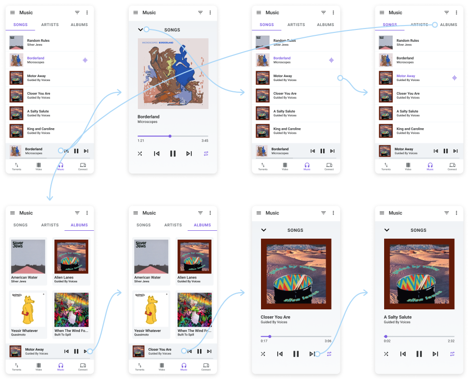
Prototype
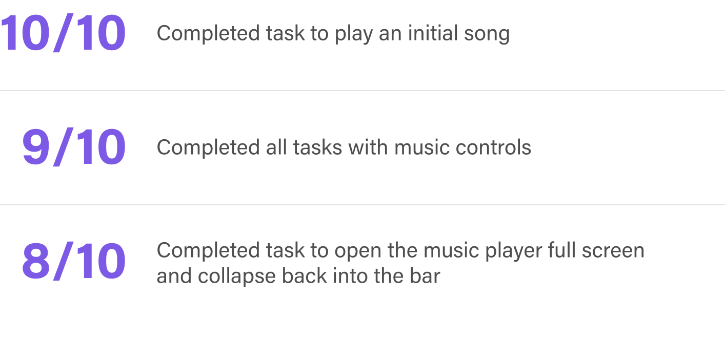
After we finalized our design changes, we tested a clickable prototype with 10 users — 5 from our research participants, and 5 from users in the community.
Development
After testing the prototype, we decided to roll out the new design to 20% of our users and compare it to the current experience. We implemented a new event for tracking the total number of songs played to measure progress toward our goals.
Based on our daily active user metrics, we estimated that it would take approximately two weeks to gather results. We planned to expand the rollout if no strong signals indicated a need to revert.
Final results
SUCCESS METRIC
5% increase in total songs played (WoW)
ACHIEVED METRIC
22% increase in total songs played (WoW)
SUCCESS METRIC
2X reduction in feedback requests
ACHIEVED METRIC
3X reduction in feedback requests


